Case study
Library of Congress: experimental interfaces for exploring collections and scale

The key focus of this project was to identify the unmet needs of library users with respect to the library’s digital collections. Through user research and new prototypes, and new and innovative approaches to how the library might address these needs were then devised and evaluated.
To decide on the target audience we used the inverted pyramid of user engagement model developed by The National Archives in the UK, to identify which overlaps existed between audiences, the project goals and LoC’s overall digital strategy. From this we agreed to focus on: “Users who might develop applications, share, learn, teach, connect or otherwise communicate with Library-like materials who are not currently connected to the Library”.
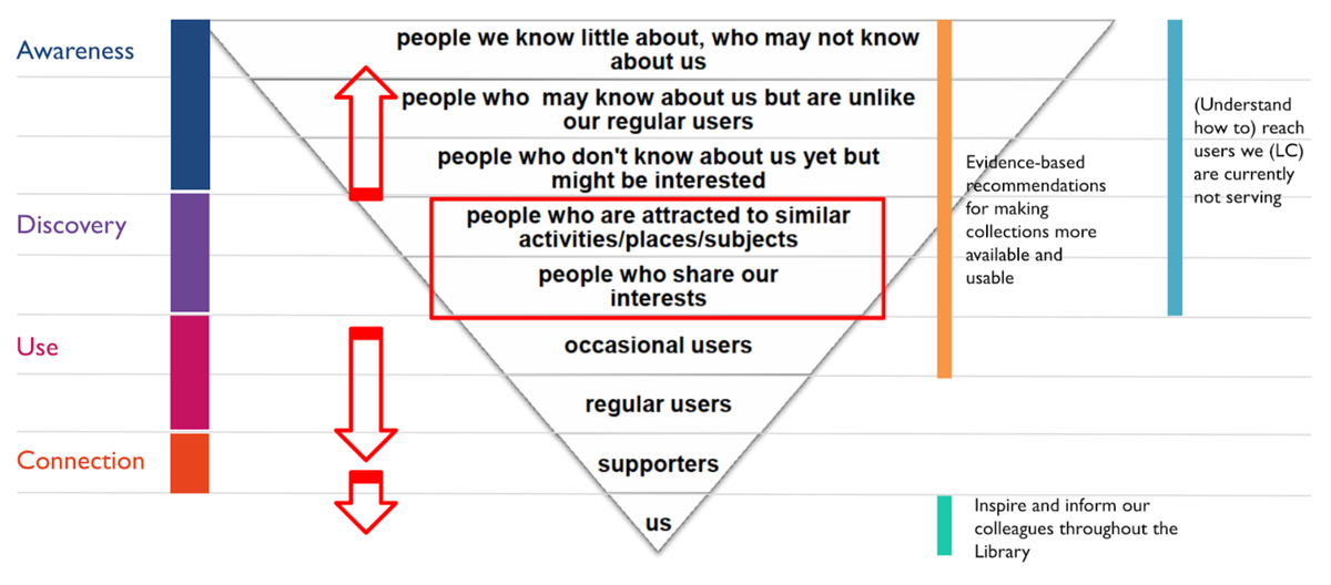 Mapping project goals to inverted pyramid of user engagement model.
We then narrowed this down to 4 personas/user types: educators. activists/community leaders, data journalists and undergraduate/ creative students.
Through collaborative ideation, sketching and prototype selection processes we shortlisted three prototype concepts based on the key opportunities that the user research for the personas above highlighted:
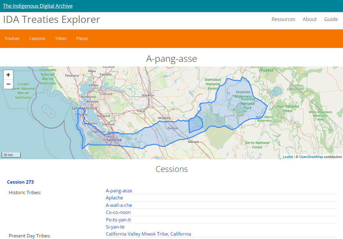
- “Fat” item page: presenting enriched information about individual items to support information-driven needs using entity linking with external sources, as well other ‘generous interface’ techniques such as maps and timelines.
- Aggregation and clustering: multidimensional clustering and visualisation of multiple items in aggregate to make it quicker to comprehend and navigate catalog information versus more standard flat list search results.
- Tagging and sharing: incorporating user created data into search and aggregation functionality and also what additional content would lend itself well for sharing by users.
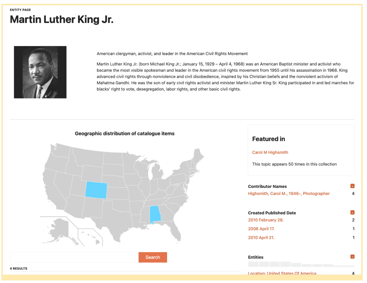 Screenshot of entity page
These prototypes were developed over a period of approximately 2 to 3 months and, after feedback and suggestions for improvements by LoC staff, were taken forward for user testing and evaluation.
All 3 prototypes were all well received by the users, with the Fat Item Page the most positively overall. Users saw the benefits this type of rich but well-organized resource could bring to them and others. Educators in particular were excited about the possibilities going as far as suggesting pages like this could be used as ‘national teaching instruments’. Entity extraction provides useful information for some users, especially educators, but more work is needed to refine the labels and language used to convey to users what these are and how they might be useful.
The tagging and sharing component was seen as an additional feature that a fat item page should have. Visualizations, as found in the Aggregation and Clustering prototype, produced promising feedback, with more exploration recommended to further refine them according to specific user types and needs.
In general the user research highlighted that target user types are looking for a user experience that is more tailored to them, and less tightly tied to the vocabularies and conceptual schemes that are familiar to librarians and information experts. Creatives and data journalists, for example, are looking for a search experience that gets them to the results they want more quickly and with less trial and error or cross-referencing with external tools like Google. Other users, however, such as students and educators, are interested in a more exploratory interface, and the site needs to support both classes of user. Users generally are looking to see more information at their fingertips with less clicking, and rich information is welcome, which validates the approaches tested in the Fat Item Page prototype, in particular.
The final report provides a lot more information on the project methodology and technical approach, including the key challenges, lessons learnt, conclusions and recommendations.
Video Demonstrations of Prototypes
More Case Studies
